{{ l }}

Studying abroad, minus the 47 browser tabs.

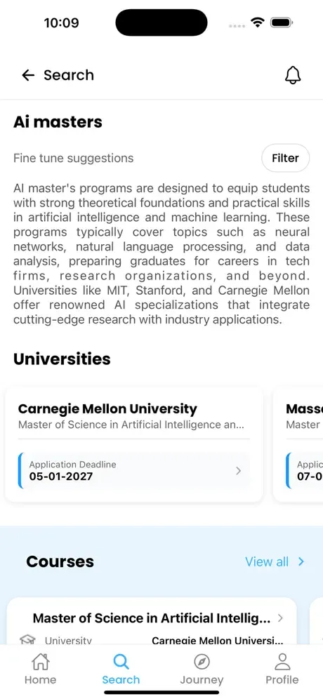
Vidysea search screen
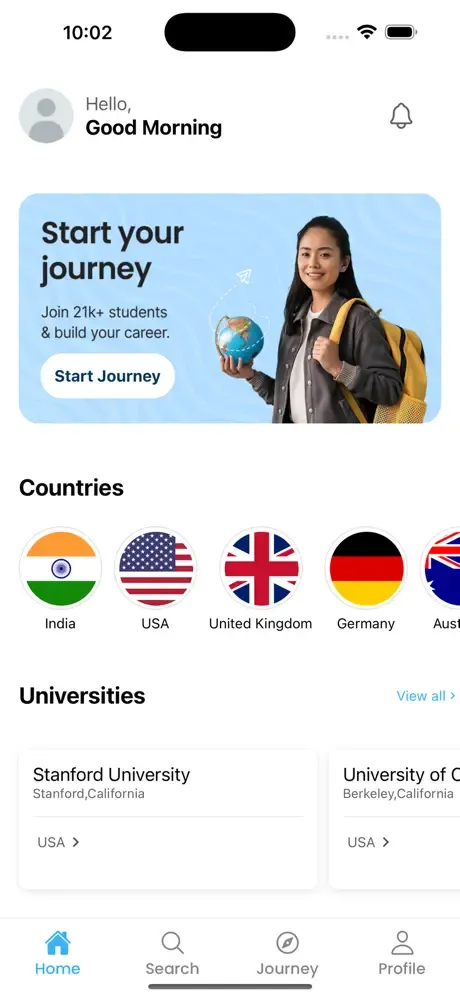
Vidysea home screen
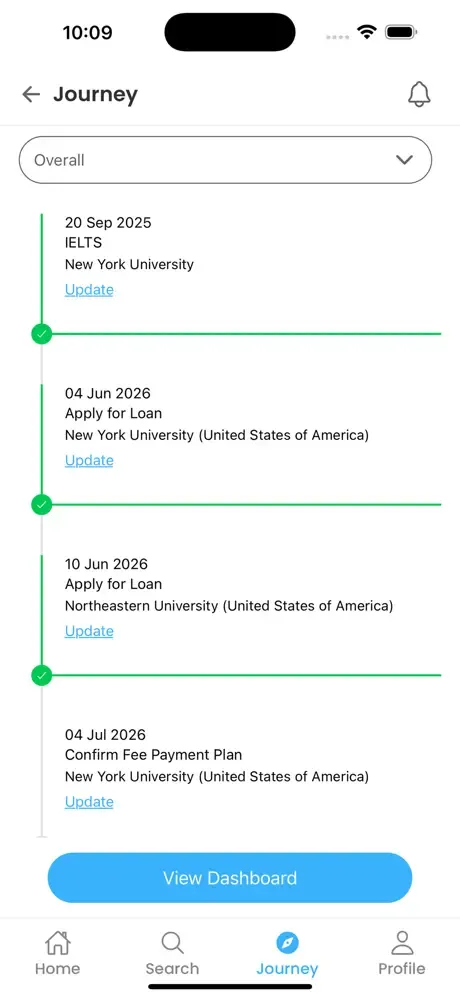
Vidysea journey screen
Case study · EdTech Product design · iOS & Android app Scroll ↓
01 — The brief

The biggest decision of your life, made in browser tabs.

{{ w }}

{{ s.n }} {{ s.t }} {{ s.d }}
02 — The problem
47 tabs open. One app open.
{{ t.t }} ×
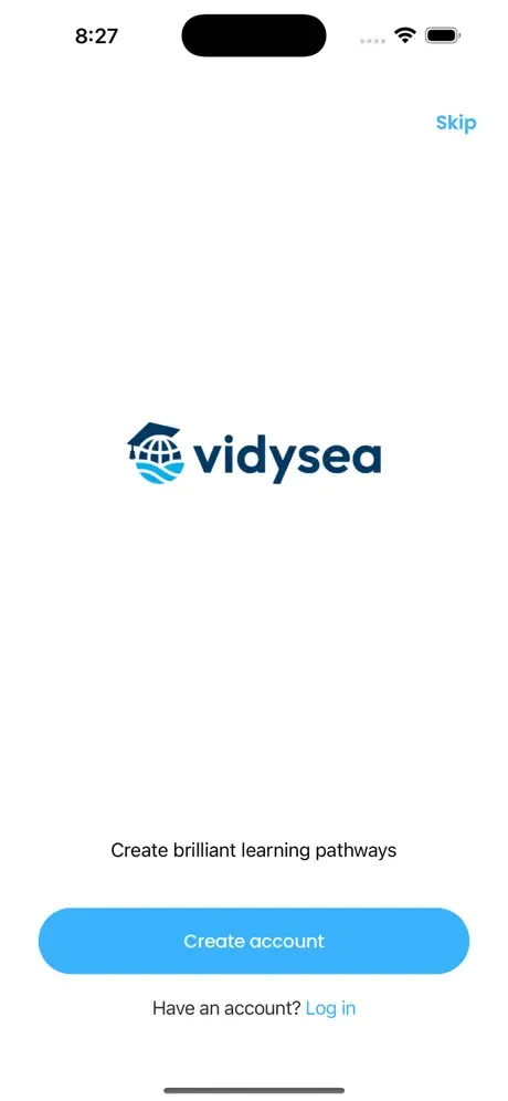
Vidysea splash screen: Create brilliant learning pathways

Rankings in one tab. Fees in another. IELTS dates, loan calculators, an agent’s WhatsApp, a cousin’s spreadsheet. We closed them all.

03 — The product

From “maybe abroad?” to boarding pass.

Six screens, one per question a student actually asks, in the order they ask them. Nothing more.

{{ s.n }} {{ s.w }}

{{ s.h }}

{{ s.t }}

{{ s.alt }}
{{ s.alt }}
04 — How we designed it

Designed for an 18-year-old and their very worried parents.

{{ r.n }}

{{ r.h }}

{{ r.t }}

05 — The journey

A to-do list that ends in another country.

Studying abroad isn’t one application. It’s thirty small deadlines spread over a year. The Journey tab turns them into one line that fills up as you go, so “what’s next?” always has an answer.

✓ {{ j.w }} {{ j.t }}

Seven screens. Zero tabs.

Get it on the App Store ↗
{{ g.alt }}
{{ g.n }}{{ g.t }}

Your app could be next.

Products built around how people actually decide, not around a template. Bring the messy problem; we’ll bring the app.

Start a conversation ↗ Next: Mavinsky →