Case study · Real estateBrand · Website · Inventory dashboardScroll ↓
01 — The brief
Every real estatebrand is a skylinein gold foil.
{{ w }}
{{ s.n }}{{ s.t }}{{ s.d }}
02 — The wordmark
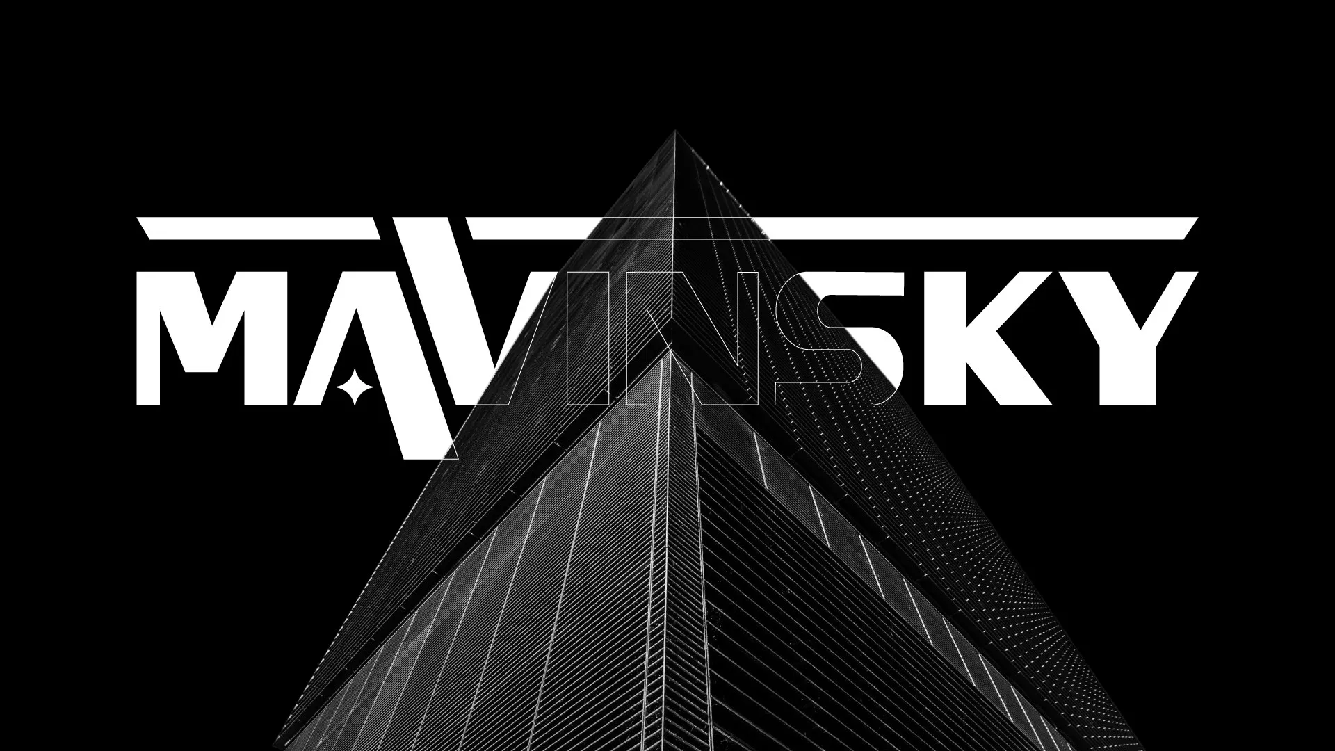
Built like a building.
01
{{ s.n }} · {{ s.w }}
{{ s.h }}
{{ s.t }}
Black, white,no gold.
The A and V lift out of the wordmark to make a monogram, each with its own star. It sits on a raised, offset tile, like a building on its plot. Two colours only: luxury doesn’t need a third.
03 — The website
A showroomthat never closes.
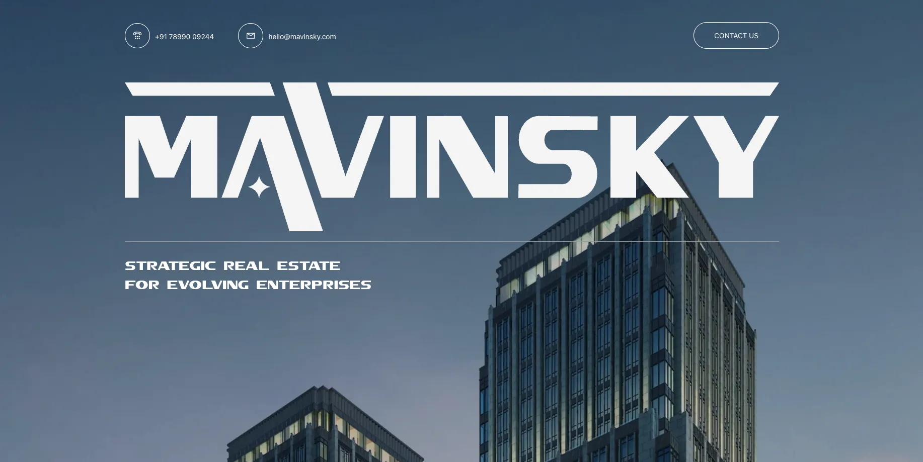
Most property sites are a brochure PDF with a contact form stapled on. We built mavinsky.com to sell the way a good site visit does: big imagery, the facts buyers actually ask about, and one clear way to book a visit.
Every unit, every tower, every status, in one place the sales team actually opens. Update a booking once and the floor plan, the numbers and the client presentation all change with it. Click a unit to try it.
{{ n.t }}
Project · Tower ARiverside Residences
{{ l.t }} · {{ l.n }}
{{ k.k }}{{ k.v }}
{{ f.label }}
Unit {{ sel.id }}{{ sel.status }}
{{ r.k }}{{ r.v }}
Share with clientMark as booked
On the skyline.
Your brandcould be next.
Brand, website and the system behind it. We build brands people remember and systems businesses actually use.