Case study · Sanitaryware · Hyderabad Identity · Packaging · Environments Scroll ↓
01 — The brief

Nobody brags about their tap. Sunso wanted them to.

{{ w }}

{{ f.k }} {{ f.v }}
02 — The mark

A sunrise that runs like water.

01
{{ s.n }} · {{ s.w }}

{{ s.h }}

{{ s.t }}

03 — The pattern

The rays don’t stop at the logo.

Pulled out of the mark, the strokes become a flowing water pattern that wraps trucks, boxes and billboards. The identity keeps working even when the logo is round the other side of the box.

Where Luxury meets everyday living.

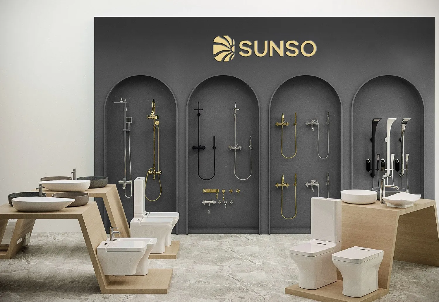
Sunso showroom wall with arched niches of showers and fittings

Sunrise, not hospital blue.

Every other brand in the aisle is blue and white. Sunso is the warm one: an orange-red sun, sand like brushed brass, and a deep night that makes chrome shine. Hover to pull one forward.

{{ c.name }} {{ c.hex }}
{{ c.role }}

One sun. Every surface.

A horizontal lockup for signs and trucks, and an arched badge for boxes, tags and the product itself. Four colour pairings, all from the same sunrise.

Sun’s out.

{{ g.alt }}

Your brand could be next.

We build brands people remember and systems businesses actually use. Even for bathrooms.

Start a conversation ↗ Next: Finvayu →