Case study · Interior design Brand identity Scroll ↓
01 — The brief

Anyone can sell you a sofa. Few can shape the room around it.

{{ w }}

{{ f.k }} {{ f.v }}
Styltool logo in white over a dark living room with a grey sofa and rust cushions
02 — The mark

Drawn like a floor plan.

01
{{ s.n }} · {{ s.w }}

{{ s.h }}

{{ s.t }}

03 — The lockups

Stacked or side by side. Never squashed.

Primary · Stacked

Mark over wordmark, centred. For signage, packaging and anywhere it gets to be the hero.

Secondary · Horizontal

Mark beside wordmark, sized from the top of the l to the tail of the y. For headers, cards and anything wide.

04 — Type wght 300
Parkinsans

One typeface, turned down to Light.

Parkinsans is geometric and open, with a quirky y and a t that curls. We tried it heavy and it looked like a gym. Light felt like a well-lit room, so Light it is. Scroll back up and watch it relax.

{{ c }}
05 — Colour

Borrowed from the materials.

Olive upholstery, khaki linen, sage plaster, oak and concrete. Five colours lifted straight off a mood board, so the brand looks like it belongs in the rooms Styltool builds. Hover to pull one forward.

{{ c.name }} {{ c.hex }}
{{ c.role }}
06 — Pattern

One module. Endless rooms.

Take the mark’s outline, keep the diagonal, repeat. It tiles in every direction without a seam, so it can wrap a bag, line a box or cover a wall. Keep scrolling and it lays itself, tile by tile.
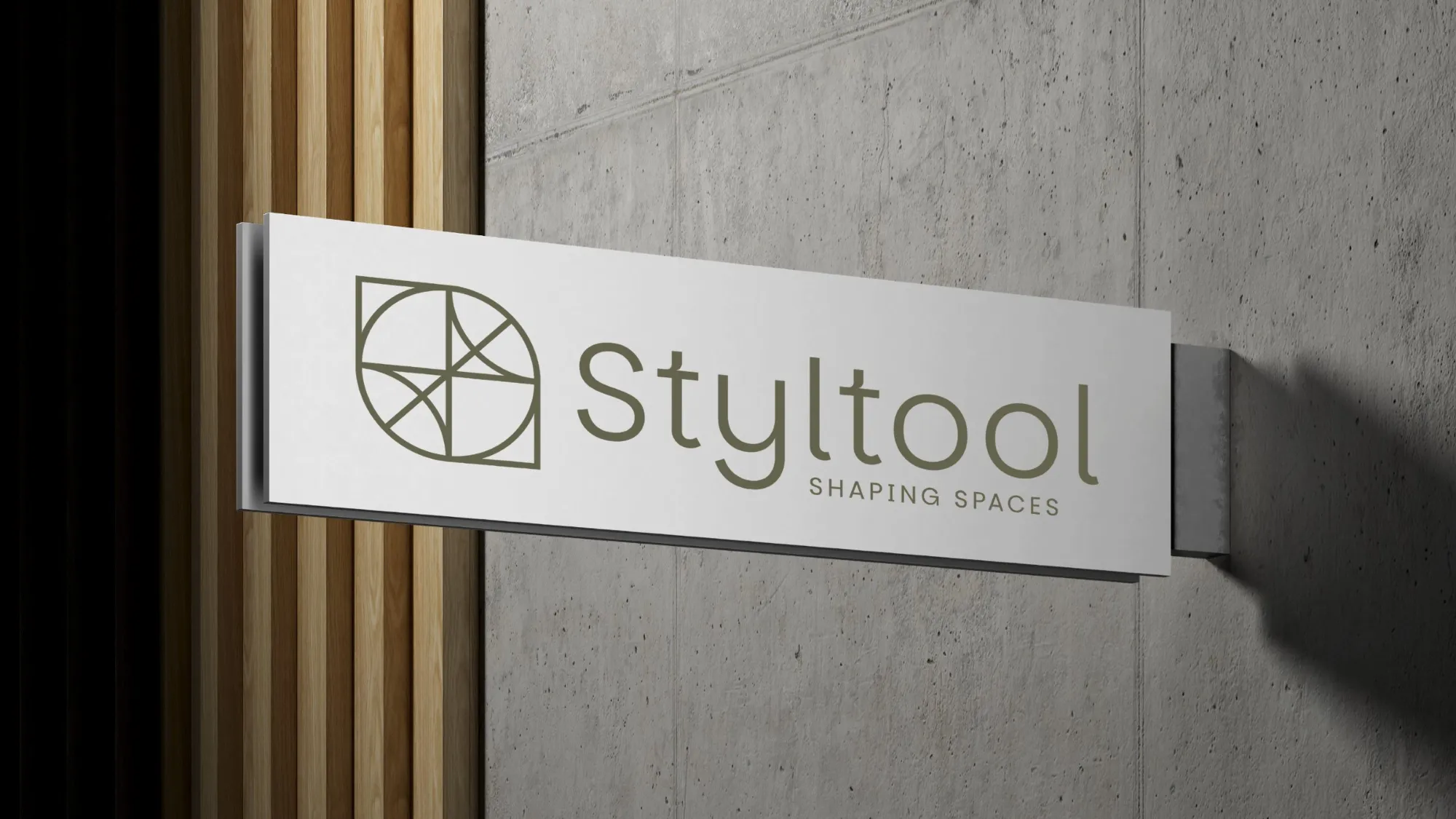
White Styltool sign with the olive horizontal lockup, mounted on a concrete wall beside timber slats
07 — In the wild
{{ g.alt }}

Your brand could be next.

We build brands people remember and systems businesses actually use. Measured twice, cut once.

Start a conversation ↗ Next: Ionara →