SMART WATER
Case study · Smart water Brand identity · Website Scroll ↓
01 — The brief

Water is just water. Until you see what’s in it.

{{ w }}

{{ f.k }} {{ f.v }}
02 — The mark

Two modules, one drop.

01
{{ s.n }} · {{ s.w }}

{{ s.h }}

{{ s.t }}

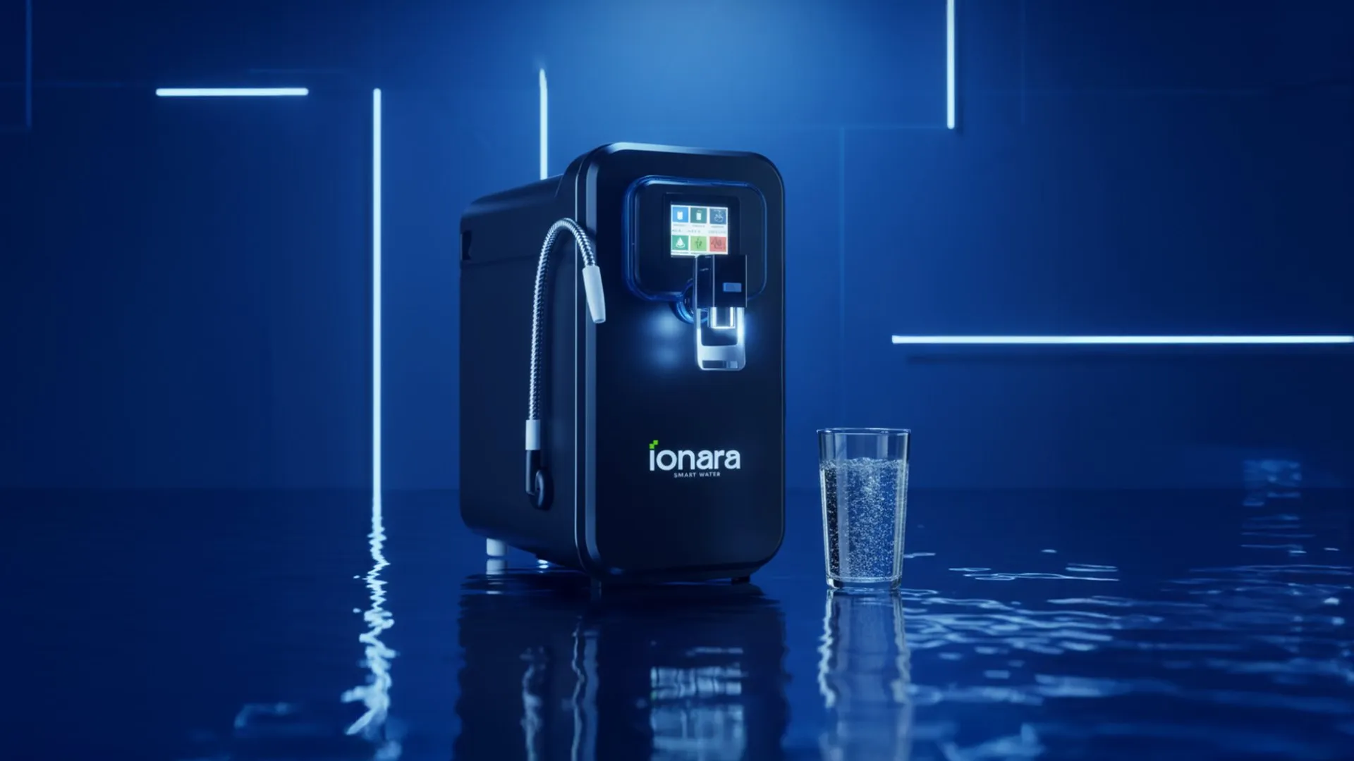
Black Ionara smart purifier on a blue reflective surface beside a glass of water

Clean first. Then a little electric.

Blue for the water, lime for the smart bit, black and white for everything else. The category is pale aqua and stock droplets. This one looks like it plugs in. Hover to pull one forward.
{{ c.name }} {{ c.hex }}
{{ c.role }}
03 — The website

Smart water for a smarter kitchen.

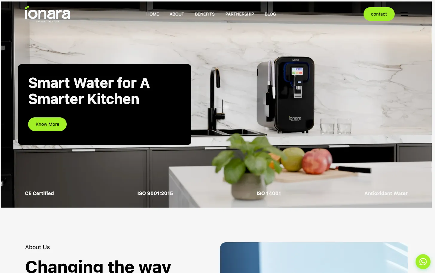
We designed and built ionarasmartwater.com to sell the machine the way it looks on the counter: product first, certifications up front, and the tech explained in plain words. One short path from “huh, nice” to “where do I buy it”.

Visit ionarasmartwater.com ↗
ionarasmartwater.com homepage: Smart Water for a Smarter Kitchen, with the purifier on a marble counter

Made for the counter.

{{ g.alt }}

Your brand could be next.

We build brands people remember and systems businesses actually use. Filtered, purified, no aftertaste.

Start a conversation ↗ Next: FDI Joinery →