Case study · Luxury interiors Brand identity Scroll ↓
01 — The brief

Luxury isn’t louder. It’s quieter, and better made.

{{ w }}

{{ f.k }} {{ f.v }}
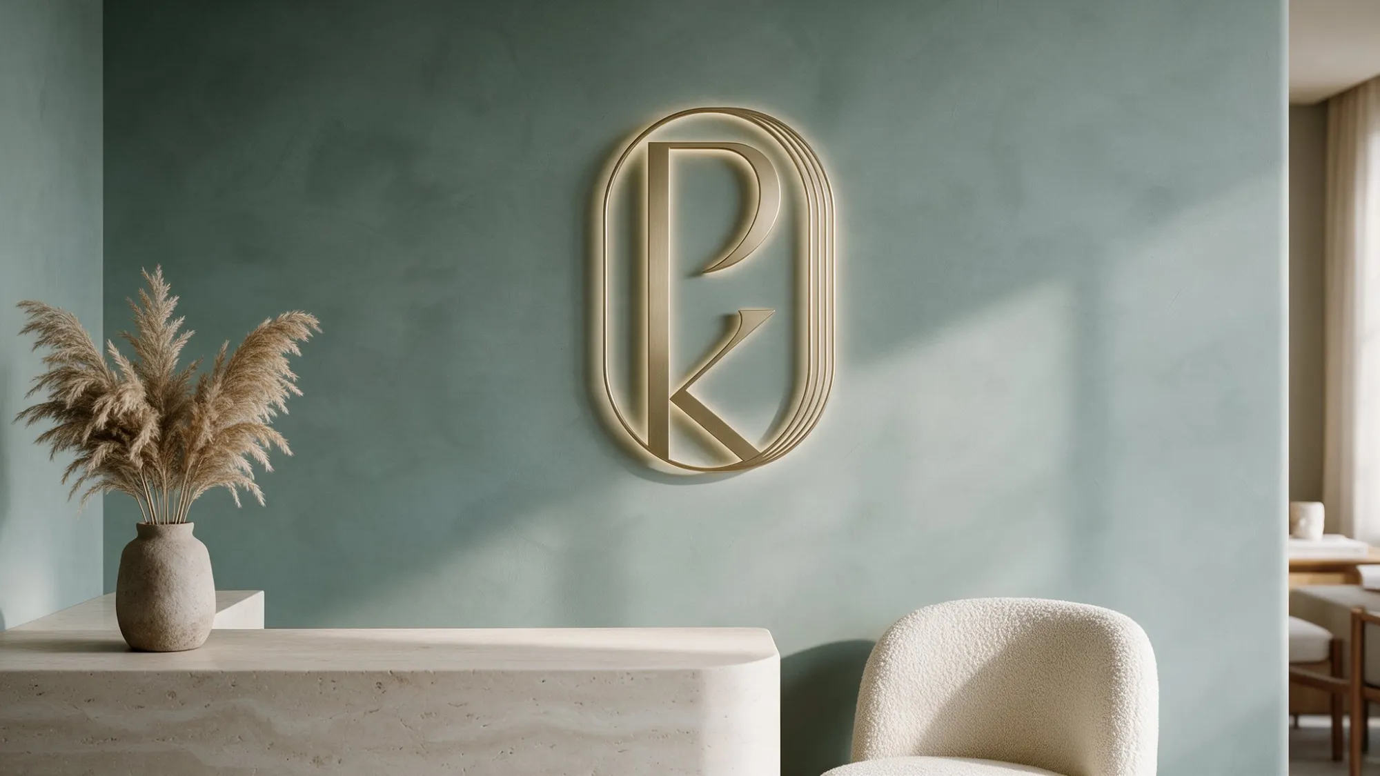
Brass PK monogram on a sage limewash wall above a travertine reception desk
02 — The mark

Four ideas, one monogram.

01
{{ s.n }} · {{ s.w }}

{{ s.h }}

{{ s.t }}

03 — The name

The material, and the making.

Ply / the material

Layers of wood, pressed until they’re stronger together than apart. The honest stuff behind every beautiful surface.

Kraft / the making

Craft, with a K that refuses to apologise. The joinery, the edges, the millimetres nobody notices until they’re wrong.

04 — Colour

Two colours. Zero shouting.

Sage grey and linen, the colours of plaster walls and raw fabric in good light. Brass, walnut and travertine show up as materials, never as ink.
Sage Grey #7E8F8D Limewash, shadow, calm. The brand’s resting state.
Linen #E6E1D0 Raw fabric and paper. Room for everything else to breathe.
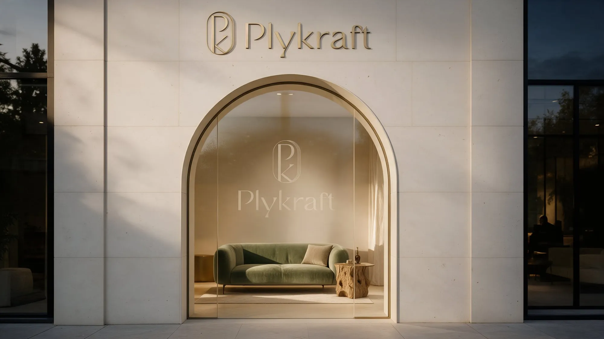
Plykraft showroom facade at dusk with an arched glass entrance and brass lettering
05 — In the wild
{{ g.alt }}

Your brand could be next.

We build brands people remember and systems businesses actually use. Quietly, if that’s your thing.

Start a conversation ↗ Next: Wudgres →