Technology Limited
Case study · Enterprise tech Identity · Website · Brand system Scroll ↓
01 — The brief

The best brand our client never shipped.

{{ w }}

{{ f.k }} {{ f.v }}
02 — The mark

From the core, outward.

01
{{ s.n }} · {{ s.w }}

{{ s.h }}

{{ s.t }}

Precision in every letter.

Custom-drawn, not typed. Hard verticals, one chamfered corner on the E, R and second E, and an N that runs its diagonal like a signal trace. It reads like engineering, because it was engineered.

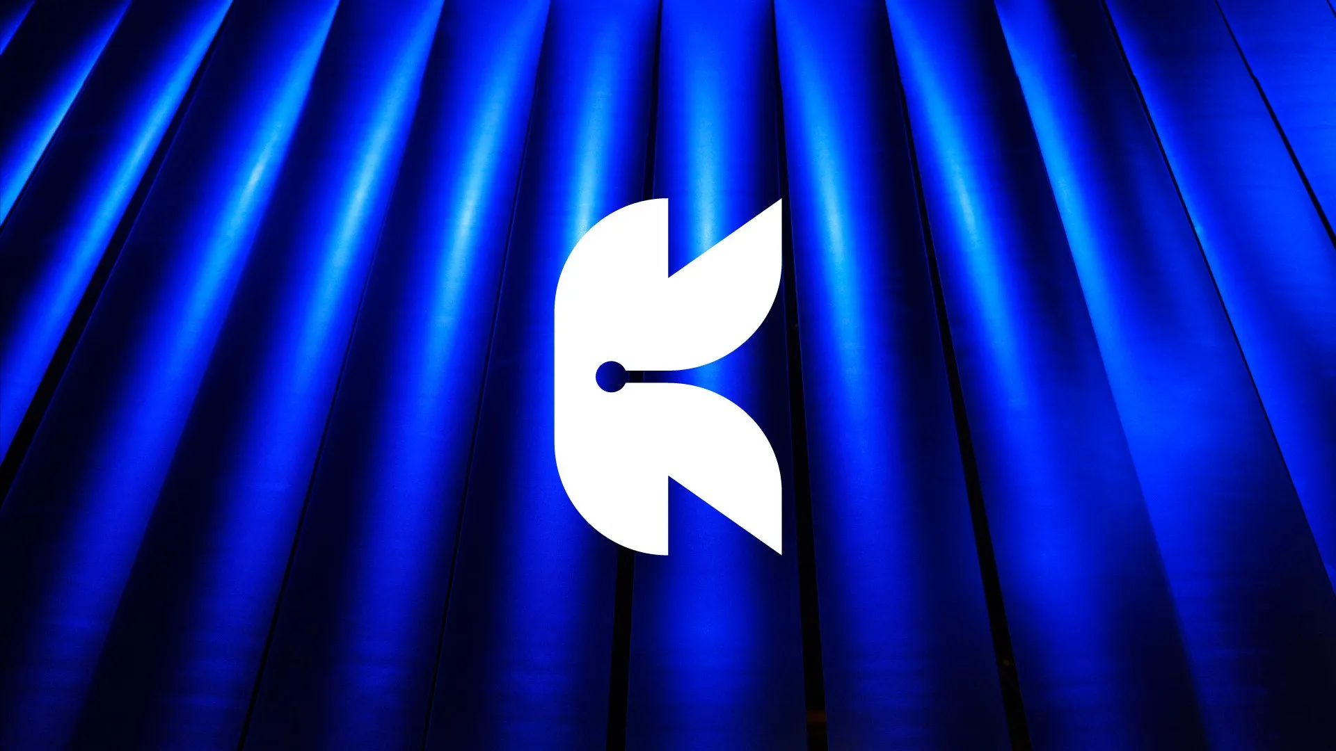
Kernel K mark in white over backlit blue pleated panels

Blue, but plugged in.

Every tech company is blue. So we didn’t pick a blue, we picked a current: electric at one end, cyan at the other, running through the mark like a signal. Hover to pull one forward.

{{ c.name }} {{ c.hex }}
{{ c.role }}

Server room to boardroom.

Gradient on void or paper, solid white on electric or graphite. The K works alone as an app icon, the full lockup carries the pitch deck.
TECHNOLOGY LIMITED
03 — The website

The name changed. The site stayed.

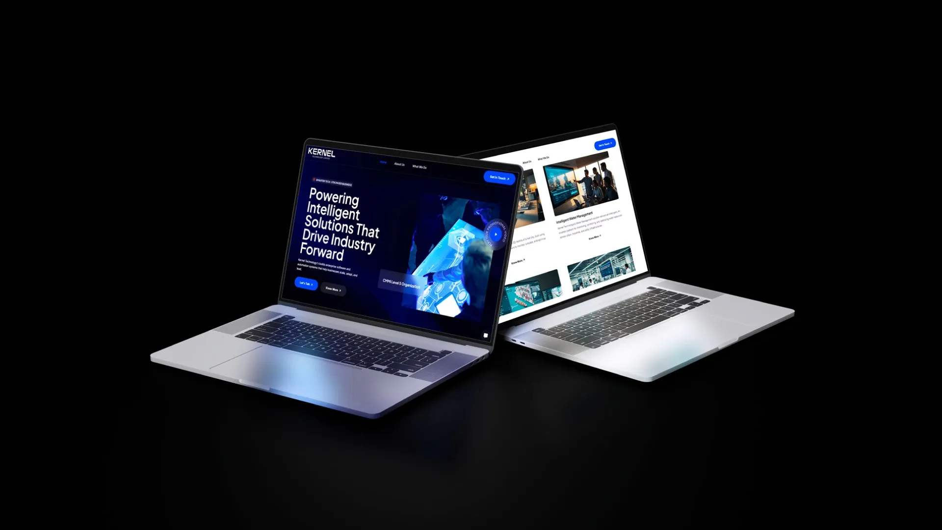
We designed and built the website alongside the identity: a dark, cinematic front door for enterprise software, automation and smart-infrastructure work. When the company went back to Nano Kernel, the site was good enough to keep. It’s still live.

Visit nanokernel.net ↗
Kernel Technology website on two laptops: dark hero and light services page

Powered on.

{{ g.alt }}

Your brand could be next.

We build brands people remember and systems businesses actually use. Ideally ones you’ll keep the name for.

Start a conversation ↗ Next: Sunso →