Case study · Healthcare Identity · Packaging · Apparel Scroll ↓
01 — The brief

A surgical brand that looks like it washed its hands.

{{ w }}

{{ f.k }} {{ f.v }}
02 — Design thinking

Five words. One mark.

01
{{ s.n }} · {{ s.w }}

{{ s.h }}

{{ s.t }}

Sketched loose. Drawn on a grid.

The wireframe started as five scribbles on a teal page. The final mark is built from two circle radii and one stroke width, so every corner matches every other corner. Surgeons notice that sort of thing.
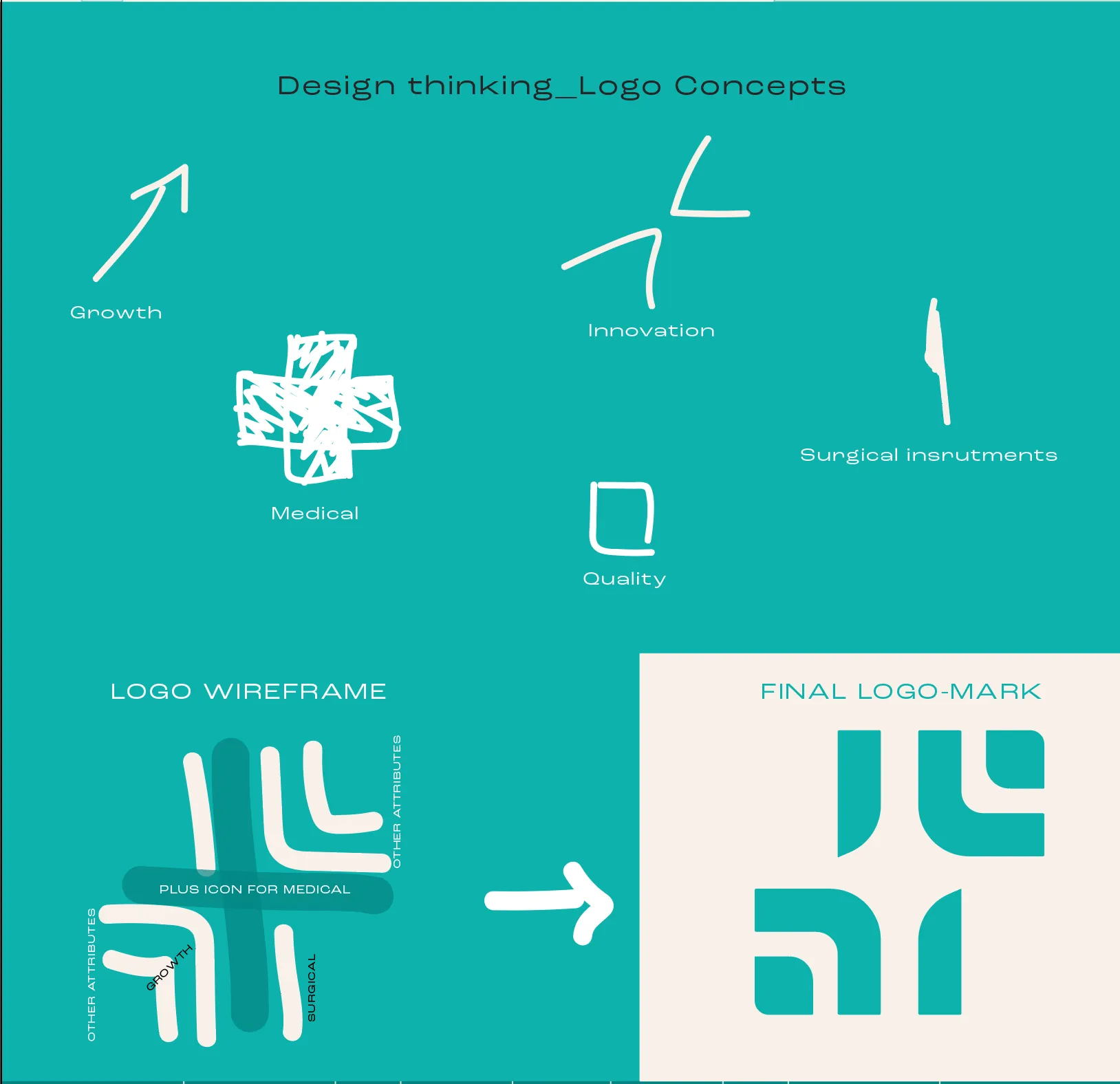

Logo concept sketches: growth, medical, innovation, quality, surgical instruments, and the wireframe
Kvela mark construction grid with guide circles

Clinical. Never cold.

Three teals borrowed from the operating theatre, three greys from the instrument tray, and a warm off-white so the brand never feels like a waiting room. Hover to pull a colour forward.
{{ c.name }} {{ c.hex }}
{{ c.role }}
04 — Typography

Wide type. Steady hands.

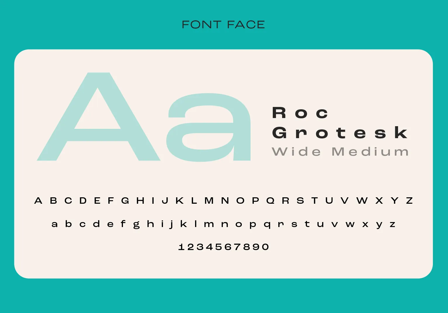
Roc Grotesk Wide Medium does the talking. Broad, level letterforms read from across a ward and still sit calmly on a 4 mm sterilisation label. KVELA is set tight and heavy, SURGICALS is tracked wide underneath, the way a spec sheet labels its parts.

Roc Grotesk Wide Medium specimen

One mark. Every surface.

Stacked, horizontal or mark-only, in four approved colourways. It holds up on a scrub pocket, a foil sachet and a shipping carton without anyone having to ask design first.

Out of the box.

{{ g.alt }}

Your brand could be next.

We build brands people remember and systems businesses actually use. Scrubs optional.

Start a conversation ↗ Next: Get Bee Seen →