Mavixy case study
Get Bee Seen — Brand identity, 2026
Move your cursor. She'll follow.
Attention is the product. So we gave it eyes.
{{ f.k }}
{{ f.v }}
How to read a bee.
01 / 04
{{ a.k }}
{{ a.h }}
{{ a.t }}
02 — Field test
You looked. That’s the job.
Wherever your cursor goes, she's watching it. That's performance marketing in one gesture: show up where attention already is, then make it look back. Tap her to launch a campaign.
0
campaigns. Still invisible.
Honey, hive & a little sage.
03 — Colour. Yellow is how nature says “look at me.” Green is how it says “relax, we know what we're doing.” A performance brand needs both, in that order.
{{ s.hex }}
{{ s.name }}
{{ s.role }}
#FFFFFF
#999999
#262626
Night shift
#191816 and friends. The neutrals that do the boring work so the bee doesn't have to.
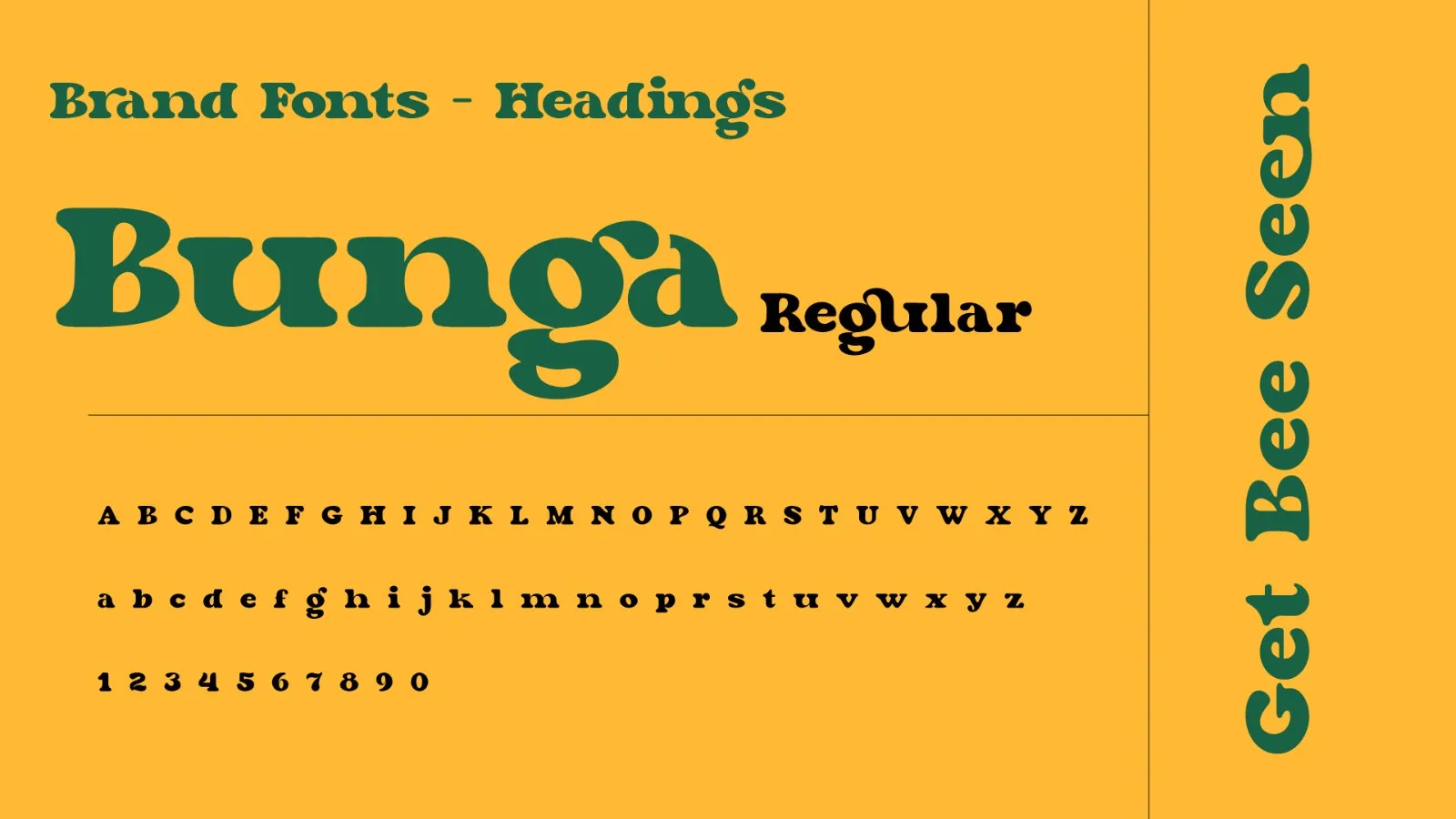
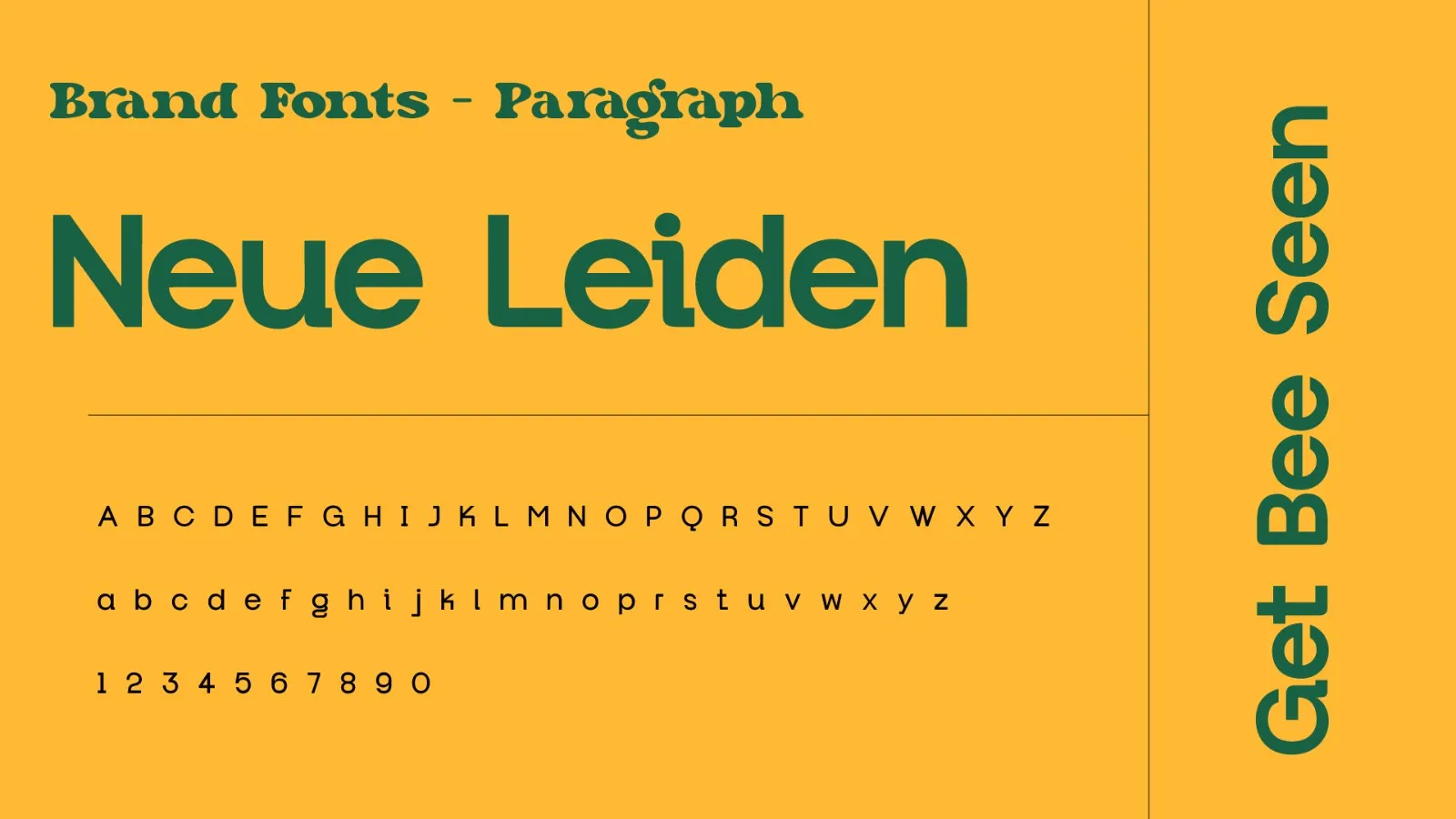
Bunga shouts. Neue Leiden explains.
04 — Type. A rubbery, groovy display face for headlines that wobble like the logo, and a clean geometric sans for everything that has to survive a Monday report.
One bee. Stick it anywhere.
05 — The system. Stacked, horizontal, bee-only and two seals, in honey, cream and sage. Drag them around. Nobody's grading this.
Out in the wild.
Your brand could be next.
We build brands people remember and systems businesses actually use. Popping eyes available on request.