CHOMP.
Mavixy case study
Snackify Me — Brand identity, 2026
Click the logo. It's still hungry.
India doesn't snack. It snackifies.
{{ f.k }}
{{ f.v }}
How to read a snack.
01 / 04
{{ a.k }}
{{ a.h }}
{{ a.t }}
Two colours. Zero chill.
02 — Colour. Every snack aisle in India is blue, silver or a nervous green. We went the other way and stayed there.
{{ s.hex }}RGB {{ s.rgb }}
{{ s.name }}
{{ s.role }}
03 — The seal
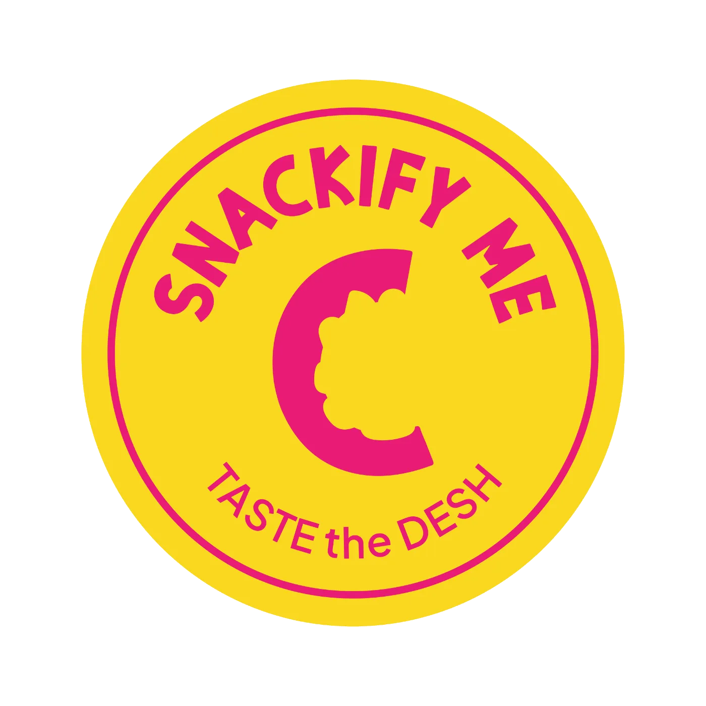
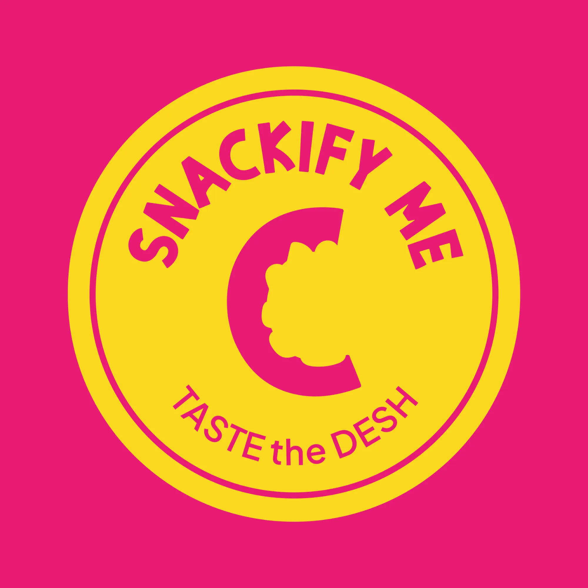
The seal of snackproval.
The bitten C on its own, ringed by the name. It goes where the full wordmark can't: lids, tapes, stickers, the back flap of a ₹10 pack. Small enough for a sachet, bold enough for a shop shutter.
04 — Field test
Go on. Take a bite.
Click or tap the chip. This is the entire brand strategy, in one interaction.
0
bites. Weak.
Out of the bag.
Your brand could be next.
We build brands people remember and systems businesses actually use. Snacks optional, but strongly encouraged at the kick-off.