Mavixy case study Aakar Industries — Brand identity, 2026
↓ Scroll to take it apart
01 — The brief

Built, not styled.

{{ w }}

{{ f.k }} {{ f.v }}
02 — The name did half the work
आकार
Aakar /aa·kaar/ Noun · Hindi, from Sanskrit
  1. Shape.
  2. Form.
  3. Structure; the outline of a made thing.

Most naming briefs come with a mood board. This one came with the answer printed on it. The brand didn't need a metaphor for shape. It needed to be the shape — one solid form that reads as an A, cut the way a workshop would cut it.

Clip-art gears need not apply.

03 — How we got there
{{ s.no }}

{{ s.h }}

{{ s.t }}

One mark. Four ideas.

01 / 04
a
{{ a.no }}

{{ a.h }}

{{ a.t }}

Signals {{ g }}

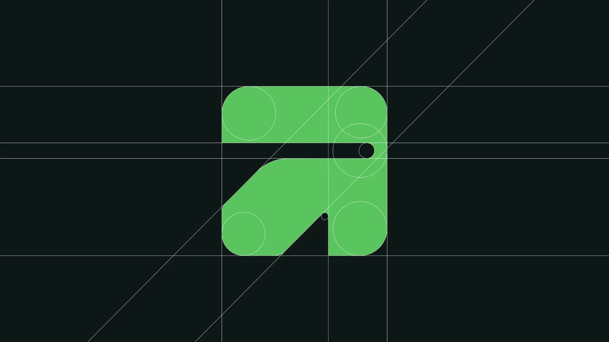
Drawn on a grid, not a whim.

04 — Construction
Aakar mark on its construction grid
{{ r.k }}

{{ r.v }}

05 — Wordmark & lockup

The letters are cut from the same sheet as the mark. The A swaps its crossbar for the mark's diagonal; the bowls are heavy and squared off, like parts fresh off a press. It sits on the baseline like it was bolted there.

Primary · on Forge Default for decks, site, signage and anything after dark.
Light · on Mint Paperwork, packaging and anywhere the room needs air.
Mono · on Green Single-colour jobs: stencils, embossing, screen print.

Steel, growth & a little air.

06 — Colour

Near-black because industry is serious. Green because growth is the point. Mint because even a factory floor deserves somewhere to breathe. Click a swatch to copy it.
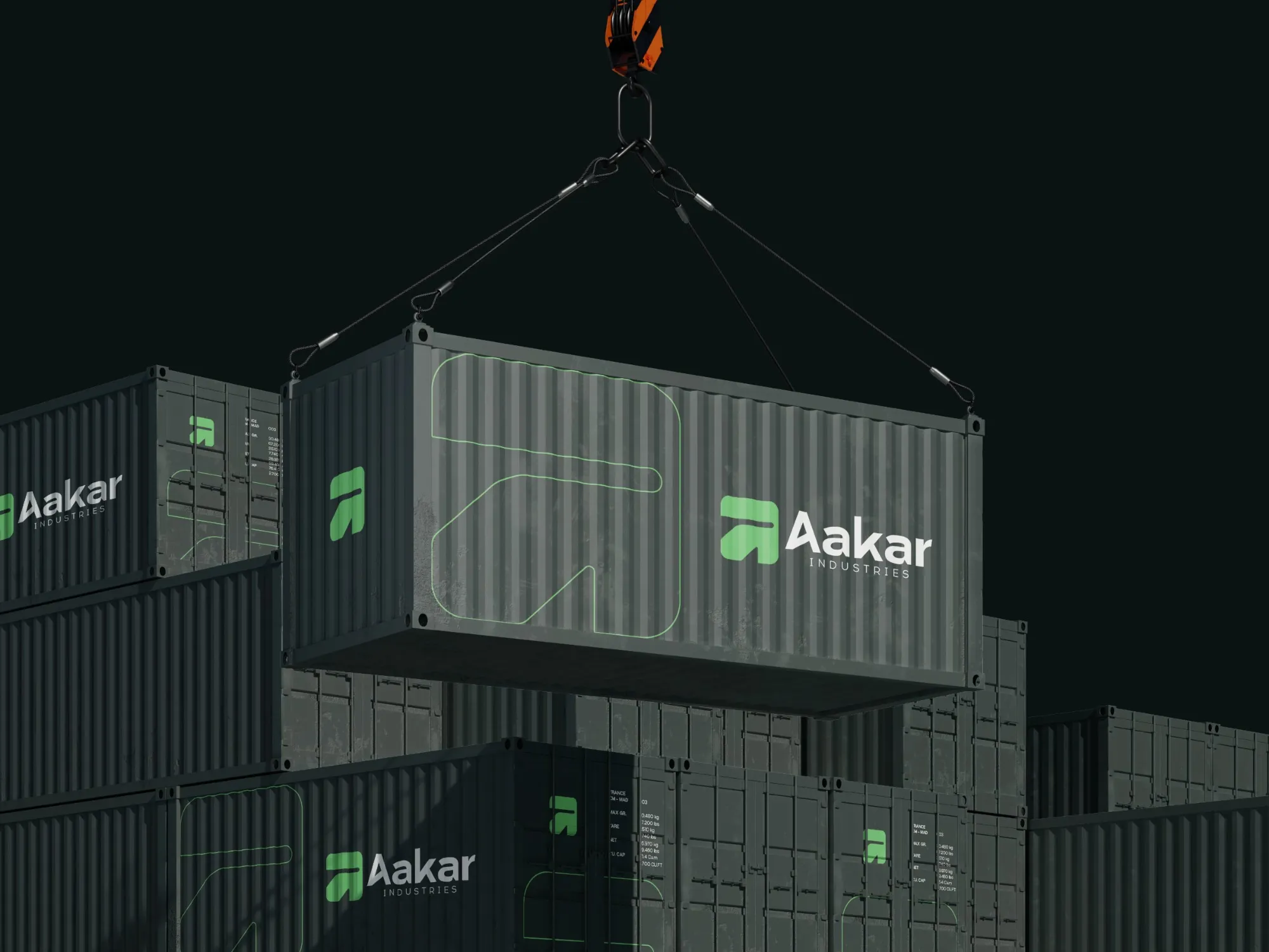
Aakar branded shipping containers lifted by crane

Readable from a crane.

At container scale the mark becomes architecture — one continuous outline across the corrugation, the full lockup by the doors. Same rules at six metres as at six millimetres.

Out in the wild.

07 — Applications
{{ p.t }} {{ p.no }} / {{ appTotal }}
{{ railHint }}
08 — Paper trail

Handshakes still matter.

Industrial deals still get done across a table. Cards, letterheads and quotes use the same system: dark for authority, green for the signature, mint for the paperwork. Move your cursor over the desk.

aakarply.comShaping spaces
Creating the structures of your aspirations. aakarply.com

The mark, as a line.

09 — The outline becomes a pattern for hoardings, packaging, uniforms and anything that would otherwise be a sad grey wall.

10 — Voice
Shaping spaceswith strengthand intention.Shaping spaces
Creating the structuresof your aspirations.Creating the structures

Two lines, two jobs. “Shaping spaces with strength and intention” is the promise on site boards and decks. “Creating the structures of your aspirations” is the line for social, where people decide in a thumb-scroll whether you're worth a follow.

The voice rules are short: talk like the foreman, not the brochure. Say what gets built, how well, and by when. Adjectives have to earn their place on the truck.

Then we built the showroom.

11 — The website

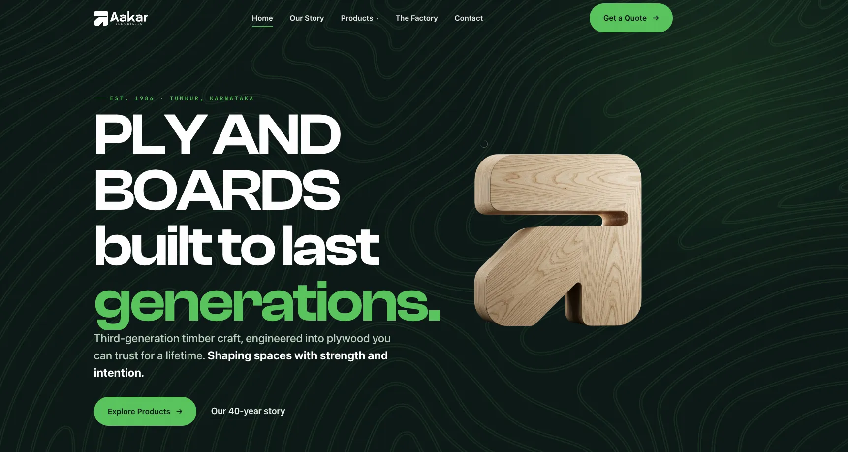
aakarply.com — a 40-year plywood maker finally gets a website as solid as its boards. Design and build by Mavixy.

aakarply.com homepage
{{ b.t }}
{{ b.k }}

{{ b.t }}

{{ b.d }}

Visit aakarply.com ↗
12 — What we handed over

A system, not a logo file.

A logo is a receipt; the system is the meal. Aakar got the rules, the files, and the reasons behind them — so the next vendor who prints a hoarding can't accidentally invent a new brand.

{{ d.no }} {{ d.t }} ↗

Aakar mark set into a tree trunk surrounded by ivy

Built to outlast the trend cycle.

← All work

Your brand could be next.

We build brands people remember and systems businesses actually use. Bring the problem; we'll bring the grid.

Start a conversation ↗